Have you ever wondered if orange can actually work well with other colors? The answer might surprise you.
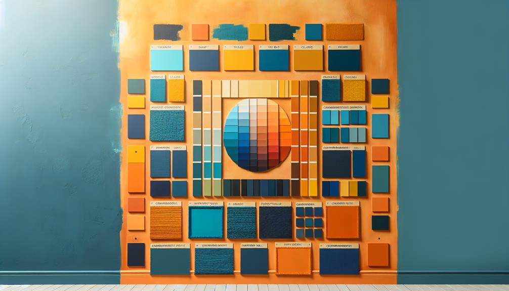
When it comes to pairing colors with orange, there are a few key principles to keep in mind. From complementary colors that make orange pop to analogous color schemes that create a harmonious look, the possibilities are endless.
But what about neutral tones or bold contrasts? Stay tuned to discover the secrets of which colors truly go with orange.
Key Takeaways
- Blue, green, purple, and warm tones like red and yellow complement orange beautifully.
- Neutrals like beige, metallics, and white are ideal for toning down or enhancing orange.
- Bold contrasts with turquoise, lime green, pink, and turquoise create dynamic and vibrant palettes.
- Earthy tones, nature-inspired greens, browns, and soft pastels harmonize elegantly with orange.
Complementary Colors
When it comes to pairing colors with orange, complementary colors play an important role in creating visually appealing combinations. Creative pairings with complementary colors can make your orange hues pop with vibrancy and style. One of the most classic complementary color pairings with orange is blue. The deep, calming tones of blue harmoniously blend with the warmth of orange, creating a striking contrast that's both energetic and balanced.
Another creative pairing is orange with green. This dynamic duo brings a fresh and lively feel to any design or outfit. The earthy richness of green complements the brightness of orange, resulting in a combination that's both eye-catching and sophisticated.
Exploring complementary colors opens up a world of possibilities for unique and harmonious blends with orange. By understanding how colors interact and enhance each other, you can create visually stunning compositions that showcase the beauty and versatility of orange in a whole new light.
Analogous Color Schemes
Exploring analogous color schemes opens up a world of harmonious combinations that enhance the vibrancy of orange hues. Analogous colors are those that sit next to each other on the color wheel, creating a seamless flow and a sense of unity. When working with orange, consider warm tones like red and yellow as your coordinating hues. These colors share similar undertones with orange, making them a perfect match for creating a visually appealing palette.
Color psychology plays a significant role in the impact of analogous color schemes. Warm tones evoke feelings of energy, enthusiasm, and creativity, which can complement the lively nature of orange. By incorporating neighboring colors that share common characteristics, you can create a cohesive and balanced look that captures attention.
Visually, analogous color schemes provide a sense of harmony and continuity, making them ideal for creating a cohesive color palette. Whether you choose to combine orange with red and yellow for a bold statement or opt for softer tones like peach and coral for a more subtle approach, analogous color schemes offer a versatile and aesthetically pleasing option for enhancing the vibrancy of orange.
Neutral Tones
Moving from the vibrant analogous color schemes that complement orange, let's now shift our focus to the subtle yet impactful world of neutral tones. When pairing orange with neutral tones, earthy neutrals and warm accents can create a harmonious balance. These colors provide a calming backdrop for the vibrant orange to pop, offering a sophisticated and grounded look to any space.
To achieve subtle contrasts and cozy vibes, consider incorporating neutral tones such as beige, ivory, and taupe alongside your orange accents. These colors blend effortlessly with orange, creating a sense of warmth and comfort in the room. The table below illustrates how orange can be paired with different neutral tones to achieve various aesthetics:
| Neutral Tones | Hex Code | Description |
|---|---|---|
| Beige | #F5F5DC | Soft and inviting |
| Ivory | #FFFFF0 | Elegant and timeless |
| Taupe | #483C32 | Earthy and sophisticated |
Bold Contrasts
I love how vibrant color combinations can bring a room to life.
Mixing orange with bold contrasts creates modern design schemes that are visually striking.
Playing with eye-catching color palettes can truly transform a space into something dynamic and energetic.
Vibrant Color Combinations
What bold contrasts can make vibrant color combinations with orange truly pop?
When aiming for a retro vibe or funky pattern, pairing orange with turquoise or lime green can create a dynamic and eye-catching look. These combinations evoke a sense of nostalgia and playfulness, perfect for those seeking a vibrant and energetic aesthetic.
If you're leaning towards a tropical paradise or beachy vibes, consider mixing orange with bright yellow or aqua blue to bring a sense of warmth and sunshine to your space. These bold color choices can transport you to a sunny destination, making your environment feel lively and inviting.
Embrace these vibrant pairings to infuse your decor with energy and personality.
Modern Design Schemes
In modern design schemes, bold contrasts can elevate the aesthetic and create a visually striking impact that captures attention instantly.
When aiming for minimalist aesthetics and contemporary elegance, pairing orange with crisp white or sleek black can bring a sense of sophistication to the space.
To achieve urban chic and industrial flair, combining orange with shades of grey or metallic accents can add an edgy and modern touch.
Introducing a burst of vibrant blue or teal alongside orange can create an invigorating and energizing atmosphere in any room.
Playing with textures like smooth glass or rough concrete in conjunction with orange hues can further enhance the modern and dynamic feel of the space.
Eye-Catching Color Palettes
Bold contrasts in color palettes can instantly captivate the eye and transform a space into a visually dynamic environment. When considering color psychology, opting for bold contrasts like pairing orange with deep navy blue or vibrant turquoise can create a striking visual impact. These combinations draw attention and add energy to a room, making a bold statement.
Cultural influences and seasonal trends also play a role in crafting eye-catching palettes. For example, in some cultures, red and orange signify joy and celebration, making them perfect for lively and festive spaces. Staying attuned to seasonal trends can inspire combinations like warm oranges with cool grays for a modern and inviting feel.
Experimenting with bold contrasts opens up endless possibilities for creating visually stimulating color palettes.
Pastel Palettes
Exploring pastel palettes with orange can create a soft and charming aesthetic for any space. When combining these delicate shades, it's crucial to strike the right balance to achieve a cohesive and visually appealing look. Here are some key points to keep in mind:
- Harmony: Blend soft hues of pastel colors like mint green, lavender, or baby blue with orange to create a harmonious and soothing atmosphere in your room.
- Accent Pieces: Use pastel accents such as throw pillows, rugs, or artwork to add pops of color to the space without overwhelming the senses.
- Natural Elements: Incorporating pastel shades with orange in natural elements like flowers or plants can bring a revitalizing and calming vibe to your decor.
- Lighting: Pay attention to lighting as it can influence how pastel colors interact with orange. Natural light can enhance the softness of these hues, while warm artificial lighting can create a cozy ambiance.
Monochromatic Options
To expand on the harmonious blend of pastel shades with orange, let's now consider the elegant possibilities offered by monochromatic options. When working with monochromatic schemes, sticking to a single color family can create a sophisticated and cohesive look. For instance, incorporating gradient shades of orange, from a soft peach to a deep burnt orange, can add depth and interest to a space.
Incorporating textured patterns within a monochromatic palette can further enhance the visual appeal. Mixing different textures like velvet, linen, or even metallic accents in varying shades of orange can create a luxurious and dynamic atmosphere. These textured patterns not only add visual interest but also tactile richness to the overall design.
Frequently Asked Questions
Can Orange Be Paired With Metallic Colors Like Gold or Silver?
Orange and metallic colors like gold or silver can definitely be paired together. The warm tones of orange complement the richness of gold and silver, creating a luxurious and elegant look that is perfect for design schemes.
What Are Some Unexpected Color Combinations That Work Well With Orange?
Unexpected color combinations that complement orange beautifully are abundant. When it comes to floral patterns, I adore pairing orange with deep teal or mustard yellow. In vintage decor, earthy tones like olive green or dusty rose create a charming harmony.
Is There a Specific Shade of Orange That Is More Versatile for Pairing With Other Colors?
When it comes to pairing orange with other colors, I find that a versatile shade like a warm, medium orange works best. It complements various hues, especially when paired with best neutrals and bold patterns.
Are There Any Cultural or Symbolic Meanings Associated With Combining Orange With Certain Colors?
Combining orange with specific colors can carry deep cultural and symbolic meanings. Understanding color theory and the psychological impact of color combinations can enhance the symbolism in design, influenced by various cultures and traditions.
How Can Different Textures and Materials Affect the Way Orange Interacts With Other Colors in a Design Scheme?
Textural contrast can enhance visual impact when combining orange with other colors. Material harmony is key for maintaining color balance in design schemes. Experimenting with different textures and materials can bring depth and intrigue.