Pairing purple with other colors can create stunning visual effects. From bold contrasts to subtle undertones, the options are endless. But how do you know which colors will truly complement and enhance the regal hue of purple?
Let's explore a variety of color combinations that will elevate your design or outfit to the next level. Whether you prefer a harmonious blend or a striking pop of color, understanding the principles of color theory can help you master the art of pairing colors with purple.
Key Takeaways
- Purple pairs dynamically with yellow for a striking contrast.
- Harmonize purple with adjacent colors like magenta and deep blue.
- Coordinate purple with jewel tones for sophistication and visual appeal.
- Experiment with metallic accents and nature-inspired hues to enhance purple ensembles.
Complementary Colors
When looking for what goes with the color purple, considering its complementary colors can help create a harmonious color palette. On the color wheel, the complementary color of purple is yellow. This vibrant pairing creates a dynamic contrast that can add energy and excitement to any design. Understanding color psychology can also enhance your use of complementary colors. Purple is often associated with luxury, creativity, and spirituality, while yellow is linked to happiness, positivity, and warmth. By combining these two complementary colors, you can evoke a sense of balance and sophistication in your color scheme.
Exploring the relationship between purple and yellow on the color wheel not only allows for a visually striking combination but also taps into the emotional impact that these colors can have on viewers. Whether you're designing a room, creating artwork, or planning an outfit, incorporating purple and yellow in a complementary way can elevate your aesthetic choices to new levels of style and expression.
Analogous Color Schemes
When exploring analogous color schemes, we uncover the art of combining colors that sit next to each other on the color wheel.
This creates a harmonious palette that evokes a sense of cohesion and balance.
Harmonious Color Combinations
Exploring harmonious color combinations, also known as analogous color schemes, can enhance the visual appeal of any design or space. When working with purple, consider pairing it with colors adjacent on the color wheel for a cohesive look.
Vibrant florals in shades like magenta or lavender can complement purple beautifully, creating a lively and harmonious atmosphere. Rich jewel tones such as deep blue or emerald green can also be excellent choices to combine with purple, adding depth and sophistication to the overall color palette.
Coordinating Color Palettes
In design, coordinating color palettes through analogous color schemes can create a harmonious and visually appealing aesthetic. When working with purple, consider these strategies:
- Vibrant jewel tones: Pairing purple with rich emerald green or sapphire blue can evoke a sense of luxury and sophistication.
- Whimsical patterns: Incorporating playful patterns like floral designs or geometric shapes in analogous colors can add a lively touch to your design.
- Retro color combinations: Explore vintage color palettes with hues like mustard yellow or burnt orange to give your design a nostalgic feel.
- Artistic flair: Blend purple with analogous colors like magenta or lavender to infuse an artistic and creative vibe into your color scheme.
Monochromatic Palettes
To create a harmonious look with purple, consider exploring monochromatic palettes that focus on varying shades of this regal color. Monochromatic palettes consist of colors that are variations of the same hue, providing a sophisticated and elegant aesthetic. When working with purple, you can experiment with different shades like lavender, lilac, and deep plum to create a cohesive and visually appealing space. These palettes not only offer a sense of unity but also allow for creativity in design.
In the table below, I showcase a range of vibrant shades and bold contrasts within the purple monochromatic palette:
| Vibrant Shades | Bold Contrasts |
|---|---|
| Lavender | Deep Plum |
| Orchid | Eggplant |
| Mauve | Magenta |
| Violet | Aubergine |
| Lilac | Indigo |
Exploring these shades within a monochromatic palette can help you achieve a striking and balanced design using the richness of the purple color spectrum.
Neutral Tones
Moving from the domain of monochromatic palettes, I now highlight the elegance and versatility that neutral tones bring when paired with the rich hues of purple. When considering what goes with purple color, earthy tones and rustic textures can create a harmonious balance, enhancing the overall aesthetic appeal. Here's how neutral tones can complement purple effectively:
- Contrast: Neutrals like beige, ivory, or taupe can provide a striking contrast against deep purples, adding depth to the color palette.
- Warmth: Earthy tones such as warm grays or camel can bring a cozy and inviting feel to a room with purple accents, creating a comfortable atmosphere.
- Texture: Introducing rustic textures like weathered wood, woven baskets, or rough-hewn stone can amplify the natural beauty of purple tones, adding an organic element to the space.
- Versatility: Neutral tones act as a versatile backdrop, allowing different shades of purple to pop or blend seamlessly depending on the desired effect.
Pastel Shades
I find that pastel shades can beautifully complement purple, offering a soft and delicate touch to any space.
From soft pastel pairings to delicate color combinations, these hues can create a serene and harmonious atmosphere.
Subtle pastel accents can add a hint of whimsy and charm to your purple-themed decor, enhancing the overall look with a touch of elegance.
Soft Pastel Pairings
Soft pastel pairings effortlessly blend together for a harmonious and soothing color palette that complements the regal allure of purple. When combining purple with soft pastels, consider these pairings:
- Pastel Florals: Incorporate delicate pastel floral patterns to enhance the softness and elegance of purple hues.
- Soft Fades: Use soft fades in pastel shades to create a seamless shift between purple and other colors, adding depth to your color scheme.
- Powder Blue: Pairing purple with powder blue creates a serene and dreamy atmosphere, perfect for a calming space.
- Blush Pink: Blush pink softens the richness of purple, resulting in a sophisticated and romantic combination that exudes charm.
These pairings offer a sophisticated and refined look that elevates the luxurious feel of purple.
Delicate Color Combinations
Enhancing the elegance of purple, delicate pastel shades offer a charming and subtle palette for sophisticated color combinations. When pairing purple with pastel florals, the soft hues create a graceful and harmonious look. Additionally, combining purple with soft jewel tones like pale pink, mint green, light peach, baby blue, or lavender can elevate the overall aesthetic, adding a touch of luxury and refinement. The gentle nature of pastel shades complements purple beautifully, enhancing its regal appeal while maintaining a sense of delicacy. Below is a table illustrating the enchanting possibilities of blending purple with pastel shades:
| Pastel Florals | Soft Jewel Tones |
|---|---|
| Pale Pink | Mint Green |
| Light Peach | Baby Blue |
| Lavender |
Subtle Pastel Accents
Subtle pastel accents play an important role in enhancing the elegance and charm of purple color combinations. When paired thoughtfully, pastel shades can bring out the best in purple hues, creating a harmonious and sophisticated look.
Here are some ways to incorporate subtle pastel accents into your purple-themed ensembles or décor:
- Floral arrangements: Soft pastel flowers like blush roses or pale pink peonies complement purple blooms such as lavender or lilac beautifully.
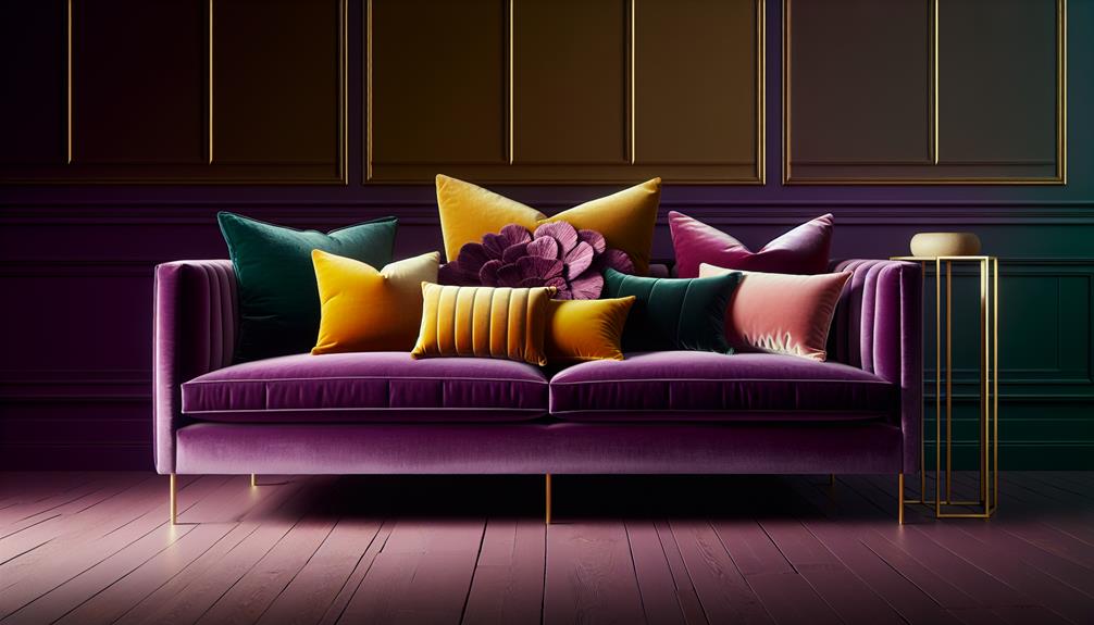
- Home decor: Pastel throw pillows, curtains, or wall art can soften the richness of purple walls or furniture, adding a touch of tranquility to the space.
- Fashion accessories: Consider pastel scarves, handbags, or shoes to add a subtle pop of color to your purple outfit.
- Makeup trends: Soft pastel eyeshadows or blushes can complement purple lipstick or nail polish, creating a dreamy and feminine look.
Bold Contrasts
Incorporate vibrant hues like yellow or red to create striking contrasts when pairing with purple color. By adding these bold colors, you can create a dynamic and visually appealing look that really makes a statement.
When choosing vibrant patterns to go with purple, consider geometric shapes or abstract designs to enhance the modern feel. Opt for modern accessories like sleek metallic jewelry or a structured handbag to complement the bold contrasts and tie the outfit together seamlessly.
For a stylish and eye-catching ensemble, pair a deep purple blouse with bright yellow trousers or a striking red skirt. The combination of these bold colors will elevate your outfit and add a touch of sophistication. Don't be afraid to experiment with different shades and textures to find the perfect balance between the colors. Remember, the key to pulling off bold contrasts is to embrace the vibrant hues with confidence and flair.
Metallic Accents
Adding metallic accents to your outfit can instantly elevate your look and give it a touch of glamour and sophistication. When it comes to pairing metallics with purple, there are a few key considerations to keep in mind:
- Shiny Silvers: Opt for shiny silver accessories like statement necklaces, earrings, or belts to add a modern touch to your purple ensemble.
- Rustic Golds: Incorporate rustic gold pieces such as bangles, rings, or clutch bags for a vintage-inspired flair that complements purple beautifully.
- Modern Metallics: Experiment with modern metallic finishes like rose gold or gunmetal to add a contemporary twist to your look while staying in harmony with the purple hues.
- Vintage Accents: Consider adding vintage metallic accents like brooches or hairpins to infuse a sense of nostalgia and elegance into your purple outfit.
Nature-Inspired Hues
When exploring the beauty of purple color, one can't help but be drawn to the enchanting allure of nature-inspired hues. Earthy tones and botanical inspiration offer a grounding effect when paired with purple. These colors, reminiscent of the rich soil and lush greenery found in nature, create a harmonious blend that evokes a sense of tranquility and balance.
Incorporating oceanic hues into a purple color scheme brings about a revitalizing and calming vibe. The deep blues and aquamarine shades mirror the natural elements of water, sky, and marine life. When combined with purple, these colors can transport you to a serene seaside escape, where the beauty of the ocean meets the mystery of the deep purple hues.
Nature-inspired hues not only complement purple but also enhance its vibrancy and depth. Whether you choose earthy tones for a more grounded look or oceanic hues for a rejuvenating twist, these natural elements can elevate the beauty of purple in your space, creating a connection to the wonders of the world around us.
Frequently Asked Questions
How Can I Incorporate Purple Into My Home Decor Without Overwhelming the Space?
I like to incorporate purple accents into my home decor by keeping it minimalist. Soft purple hues paired with natural elements create a soothing atmosphere without overwhelming the space, allowing the color to pop subtly.
Are There Any Cultural or Historical Associations With the Color Purple That I Should Be Aware Of?
Cultural significance and historical context are vital when considering the color purple. Understanding its symbolism in various cultures and time periods can enrich our appreciation for this hue and inspire thoughtful design choices.
What Are Some Common Misconceptions About Using Purple in Fashion and Design?
Purple misconceptions often revolve around it being too bold or difficult to pair. Understanding color psychology helps in realizing its versatility. Fashion trends embrace purple, offering design tips to elegantly incorporate this rich hue.
Can Purple Be a Versatile Color for Different Seasons, or Is It More Commonly Associated With a Specific Time of Year?
Purple is a versatile color in fashion trends and wedding ideas, suitable for all seasons. It's not limited to a specific time of year. I find it adaptable, adding elegance and richness to any style or event.
Are There Any Specific Psychological Effects or Emotions That Are Commonly Associated With the Color Purple?
Purple is known in color therapy for sparking creativity and intuition. It's linked to luxury and creativity in marketing and branding. The color evokes mystery and royalty, often associated with spirituality and higher consciousness, affecting mood positively.