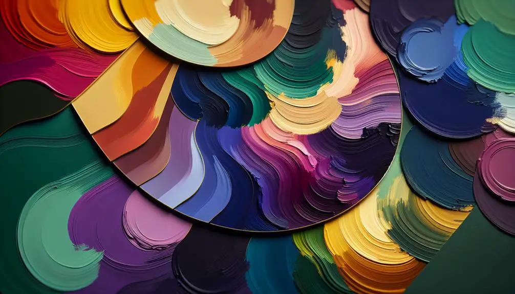
When considering colors that work well with purple, one might not realize that this versatile hue pairs beautifully with a range of shades beyond the expected.
Neutrals like soft grays and whites provide a sophisticated backdrop, while blues and greens offer a calming contrast. Pops of pink, yellow, and orange can inject energy and warmth, and metallics like gold add a touch of luxury.
Curious to discover how these combinations can elevate your décor or wardrobe? Join me in exploring the endless possibilities of complementing purple with an array of enchanting hues.
Key Takeaways
- Beige, ivory, gray, and taupe harmonize beautifully with purple, creating a soft ambiance.
- Blues like sky blue and navy add elegance and depth to purple color schemes.
- Pink tones such as blush and mauve complement purple for various styles and moods.
- Yellow tones like sunflower and lemon create bold contrasts and luxury when paired with purple.
Neutrals
When I think about pairing purple with other colors, neutrals always come to mind as a reliable choice to create a sophisticated look. Neutral tones like beige, ivory, gray, or taupe can complement purple beautifully, allowing the richness of the purple hue to stand out without overwhelming the eye. Earthy palettes, in particular, work wonders with purple, creating a harmonious and grounded feel.
Pairing purple with neutrals can be a versatile choice for both casual and formal settings. For a more subdued and classic look, pairing a deep purple with shades of gray can evoke a sense of elegance and maturity. On the other hand, combining purple with lighter neutrals like beige or ivory can create a soft and romantic ambiance, perfect for a cozy evening or a daytime event.
Experimenting with different textures and materials within the neutral color spectrum can add depth and interest to your purple-themed ensemble or living space. Mixing and matching textures like linen, suede, or faux fur in neutral tones can elevate the overall look and feel, creating a visually appealing contrast that's both sophisticated and inviting.
Blues
Curious about how to pair purple with blues for a fresh and vibrant color combination? Blues offer a wide range of shades that can complement purple beautifully. When aiming for oceanic vibes, consider incorporating sky blue tones into your design. These lighter blues can create a sense of calmness and serenity, perfect for a relaxing atmosphere. For a more sophisticated look, navy accents work wonders with purple. The deep richness of navy hues adds a touch of elegance and depth to any space. If you're looking to create a dramatic effect, midnight blues can be an excellent choice. The dark intensity of midnight hues paired with purple can evoke a sense of mystery and luxury.
| Oceanic Vibes | Navy Accents | Sky Blue |
|---|---|---|
| Sky Blue | Navy | Midnight |
| Serenity | Elegance | Calmness |
| Relaxing | Sophisticated | Dramatic |
Greens
Let's chat about how greens can be a fantastic companion to purple!
Complementary color schemes are a go-to, but exploring different shades of green can really elevate the pairing.
Complementary Color Schemes
Exploring the vibrant world of complementary color schemes with greens can add depth and balance to your purple palette. When combining purple with greens, consider the following:
- Color Psychology: Greens evoke feelings of harmony and balance, complementing the creativity and luxury associated with purple.
- Design Trends: Modern design trends often feature bold combinations of purple and vibrant greens for a fresh and energetic look.
- Creative Combinations: Experiment with different shades of green, from mint to emerald, to find the perfect balance with your purple hues.
- Color Wheel Theory: Greens sit opposite purples on the color wheel, creating a striking contrast that can make your design pop.
- Balance and Harmony: The use of greens as complementary colors can bring a sense of unity and cohesion to your overall color scheme.
Different Shades of Green
When considering different shades of green to complement purple, exploring a range from soft mint to rich emerald can enhance the overall balance and vibrancy of your color scheme.
Mint green offers a delicate touch, creating a fresh and serene atmosphere when paired with purple.
On the other hand, emerald green brings depth and sophistication, adding a luxurious feel to the combination.
Forest green introduces a sense of nature and tranquility, ideal for creating a calming ambiance.
For a more vibrant and energetic look, lime green can be a striking choice to contrast with purple, injecting a pop of color and liveliness into your design.
Experimenting with these various shades of green can elevate your color palette and create a visually enchanting space.
Creating Visual Balance
To achieve visual balance with greens in your color scheme, consider incorporating various shades to create a harmonious and alluring aesthetic. When working with green hues, creating contrast and incorporating patterns can elevate the overall look.
Here are five tips to help you master the art of balancing greens in your design:
- Mix light and dark green tones for depth and dimension.
- Introduce a pop of a complementary color like coral or mustard for a vibrant touch.
- Experiment with different textures to add visual interest to the green palette.
- Use green as a base color and layer with accents in white or gold for a sophisticated feel.
- Balance bold green elements with neutral tones like beige or gray for a polished look.
Pinks
I love how pink shades can complement and harmonize with purple in such a delightful way. These colors create a soft and charming palette that brings a sense of romance and sophistication to any space.
Whether it's a light blush or a deep magenta, pink hues can add a lovely contrast and warmth when paired with purple tones.
Complementary Pink Shades
Exploring the domain of complementary pink shades to pair with purple opens up a world of vibrant and harmonious color combinations. When it comes to enhancing purple with pink hues, the options are truly delightful. Here are some fantastic pairings to contemplate:
- Blush Pink: A soft and romantic option that complements purple beautifully.
- Hot Pink: For those who seek bold contrasts, this vibrant shade can create a striking look.
- Mauve: A sophisticated choice that adds depth and elegance to purple tones.
- Bubblegum Pink: An energetic and fun color that can liven up a purple palette.
- Dusty Rose: A dusty, muted pink that pairs well with various shades of purple, creating a subtle yet charming aesthetic.
Harmonizing With Purple
Harmonizing effortlessly with purple, various shades of pink create alluring color combinations that elevate any design palette.
Purple accents can be beautifully enhanced by soft blush pinks, creating a sophisticated and elegant look.
The contrast between deep purples and vibrant hot pinks can inject energy and excitement into a room, making a bold statement.
By incorporating different shades of pink alongside purple, you can achieve a compelling balance that's visually striking.
Whether using pale pinks for a subtle touch or bright pinks for a more daring aesthetic, the versatility of pink makes it a perfect companion to purple.
Experimenting with these bold contrasts can truly transform your space into a captivating and stylish environment.
Yellows
When considering colors that work well with purple, yellow hues can bring a vibrant and complementary contrast to create a striking visual impact. Yellow tones add a lively touch to purple, enhancing its depth and creating a dynamic color scheme. Here are some ways in which yellow can be paired with purple to achieve a harmonious blend:
- Sunflower Contrasts: Pairing deep purple tones with bright sunflower yellow can create a bold and eye-catching contrast that adds energy to any space.
- Lemon Accents: Incorporating lemon yellow accents into a purple-themed room can bring a fresh and modern twist, brightening up the space with a pop of color.
- Gold Accents: Adding touches of gold alongside purple can create a luxurious and elegant look, especially suitable for formal settings.
- Soft Buttercup Tones: Soft buttercup yellow tones can create a soothing and harmonious palette when paired with light purple shades, perfect for creating a serene atmosphere.
- Mustard Undertones: Using mustard yellow undertones with rich purple hues can evoke a sense of warmth and sophistication, ideal for cozy interiors.
Pairing purple with different shades of yellow opens up a world of possibilities, allowing for diverse and visually appealing color combinations.
Oranges
To continue our exploration of colors that complement purple, let's now shift our focus to the vibrant and energetic hues of oranges. Citrus inspiration can infuse a space with lively energy when paired with purple. The dynamic contrast between purple and orange creates a visually stimulating environment that's both bold and invigorating.
When incorporating oranges into a design scheme, consider vibrant pairings that evoke a sense of warmth and creativity. Tangerine accents can add a modern twist to a room, injecting a pop of color that enlivens the space. Whether through small decor elements like throw pillows or larger pieces of furniture, the addition of orange can bring a sense of playfulness and vitality to any setting.
Grays
Exploring the versatile shades of grays can add depth and sophistication to the color palette when paired with purple. Grays are neutral colors that can create a sense of balance and calmness when combined with the richness of purple. In color psychology, gray is often associated with practicality and timelessness, making it an excellent choice to complement the creativity and mystery of purple. When used together in interior design, the purple-gray combination can evoke a sense of elegance and modernity in a space, enhancing the overall decor palette.
- Balance: Gray helps to balance out the boldness of purple, creating a harmonious blend.
- Sophistication: The combination of purple and gray exudes a sophisticated and upscale vibe.
- Timelessness: Gray is a classic color that never goes out of style, ensuring longevity in design choices.
- Versatility: Different shades of gray can be used to achieve various moods and aesthetics when paired with purple.
- Elegance: The pairing of purple and gray adds a touch of refinement and elegance to any room.
Golds
For a touch of luxury and warmth, consider incorporating golds into your color scheme alongside purple. Golds bring a sense of opulence and sophistication to any space, making it a perfect complement to the regal undertones of purple. Whether through metallic accents or rich textures, gold can add a touch of vintage charm and elegance to your decor.
When pairing gold with purple, think about balance. Too much gold can overwhelm the space, so consider using it strategically as an accent color. Metallic accents like gold frames, light fixtures, or decorative objects can catch the light and create a luxurious feel. Additionally, incorporating rich textures such as velvet or silk in shades of gold can add depth and visual interest to your design.
Frequently Asked Questions
Can Purple Work Well With Metallic Tones Like Silver or Bronze?
Purple and metallic tones like silver or bronze can work well together. The combination adds a modern touch to any space. Mixing purple with bronze creates a chic and elegant look that can elevate your decor.
Are There Any Specific Shades of Purple That Pair Better With Neutrals Than Others?
When it comes to pairing neutrals with different shades of purple, color psychology can guide choices. Lighter purples like lavender are airy and soft, working well with whites and greys in fashion and interior design.
How Can I Incorporate Purple Into a Room Without It Overwhelming the Space?
To incorporate purple without overwhelming a room, I suggest mixing textures to add depth and layering colors for dimension. Play with proportions by using purple as an accent rather than a dominant color, balancing tones for a harmonious space.
Are There Any Cultural or Historical Associations With Purple That Influence Its Color Combinations?
Historical significance and cultural influences play a significant role in the color combinations involving purple. Understanding the rich history and symbolic meanings behind this majestic hue can guide us in creating harmonious and impactful color palettes.
Are There Any Specific Patterns or Textures That Complement Purple in a Color Scheme?
When considering patterns and textures to complement purple in a color scheme, I find that textile patterns like damask or ikat add depth, while geometric designs bring a modern touch. Natural textures and abstract art also enhance the richness of purple.