When choosing and mixing tie-dye colors, use the color wheel to guide you. Stick to primary, secondary, or tertiary colors to understand blends. Pair complementary colors for bold contrast or analogous colors for smooth shifts. Avoid mixing too many hues directly to prevent muddy results, and tweak intensity by adding white or black. Plan your palette carefully to keep colors vibrant and balanced. Keep exploring, and you’ll reveal even more ways to create stunning, harmonious designs.
Key Takeaways
- Use the color wheel to select primary, secondary, and tertiary colors for balanced tie-dye designs and predictable color blending.
- Choose complementary colors for high contrast or analogous colors for harmonious, smooth blends in your tie-dye patterns.
- Avoid mixing complementary colors directly to prevent muddy browns; limit blending to adjacent colors on the color wheel.
- Adjust color intensity by adding white for pastels or black for deeper shades, but use black sparingly to avoid overpowering hues.
- Plan your color palette and pattern layout ahead to control color placement, reduce overlap, and achieve bold, vibrant tie-dye results.
Understanding the Color Wheel for Tie-Dye
A solid grasp of the color wheel is essential when creating stunning tie-dye designs. You’ll use it as your map to understand how colors relate and interact. The wheel organizes hues in a circle, showing relationships like harmony and contrast.
By knowing where colors sit on the wheel, you can predict how they blend or stand out. This helps you avoid muddy mixes and create vibrant patterns. When you pick your dyes, refer to the wheel to see which colors complement or contrast each other.
It guides your choices, whether you want smooth shifts or bold statements. Mastering the color wheel lets you experiment confidently, turning simple fabrics into eye-catching, colorful art.
It’s your first step toward creative, well-balanced tie-dye projects.
Primary, Secondary, and Tertiary Colors Explained
Since understanding the color wheel is essential, you should start by learning about primary, secondary, and tertiary colors, which form its foundation.
Primary colors—red, blue, and yellow—are pure hues that you can’t create by mixing others. When you combine two primary colors, you get secondary colors: green, orange, and purple. These are vibrant and perfect for eye-catching tie-dye patterns.
Primary colors—red, blue, and yellow—mix to form vibrant secondary colors like green, orange, and purple for bold tie-dye designs.
Tertiary colors come from mixing a primary color with its adjacent secondary color, resulting in hues like red-orange or blue-green. These shades add depth and variety to your designs, making your tie-dye more dynamic.
Knowing these categories helps you predict how colors will blend, so you can create harmonious or bold patterns intentionally, rather than by chance. Mastering this basics boosts your tie-dye creativity and color control.
Complementary Colors and How They Enhance Your Design
You’ll want to understand complementary colors—pairs that sit opposite each other on the color wheel—to make your tie-dye designs pop.
Using these colors together creates strong visual contrast that grabs attention. Just be sure to balance their intensity so the colors enhance each other without overwhelming your design.
Definition of Complementary Colors
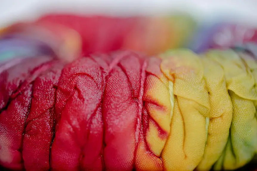
Complementary colors sit opposite each other on the color wheel, creating striking contrasts that make your tie-dye designs pop. When you pair colors like red and green, blue and orange, or yellow and purple, you tap into this natural opposition.
These pairs balance each other by combining warm and cool tones, resulting in vibrant, eye-catching effects. Knowing these relationships helps you select colors that enhance each other instead of clashing.
When you mix complementary colors in your dye, they can neutralize to earthy tones, so use them carefully for sharper contrasts. Understanding complementary colors lets you craft bold, dynamic designs with intentional color harmony, giving your tie-dye projects a professional and polished look.
Visual Impact in Tie-Dye
Pairing colors that sit opposite each other on the color wheel can instantly boost the visual impact of your tie-dye designs. When you use complementary colors like blue and orange or red and green, you create a striking contrast that makes each hue pop.
This contrast grabs attention and adds energy to your piece, making it more vibrant and dynamic. You don’t need to overcomplicate your design; just placing these colors side by side enhances depth and dimension.
Plus, complementary pairs help define shapes and patterns clearly, ensuring your design stands out from a distance. By thoughtfully incorporating these color combinations, you give your tie-dye creations a bold and eye-catching appeal that’s hard to ignore.
Balancing Color Intensity
When you combine colors that sit opposite each other on the color wheel, you create a natural balance that controls the intensity of your tie-dye design. Complementary colors, like blue and orange or red and green, enhance each other’s vibrancy without overwhelming the eye.
Using these pairs strategically helps you avoid colors clashing or appearing dull. To balance intensity, apply one color more dominantly and use its complement as an accent. This approach keeps your design lively yet harmonious.
Analogous Colors for Smooth Color Transitions
You’ll find that analogous colors sit next to each other on the color wheel, making them perfect for smooth shifts in your tie-dye designs.
Using these hues helps create a harmonious blend without harsh contrasts.
Try pairing colors like blue, teal, and green to see how effortlessly they flow together.
Definition of Analogous Colors
Analogous colors sit side by side on the color wheel, creating a natural harmony that’s perfect for smooth shifts in tie-dye designs. When you use these colors, you blend hues that share similarities, making changes gentle and visually pleasing. For example, pairing yellow, yellow-green, and green gives you a serene gradient without harsh contrasts. You can identify analogous colors by looking at any section of the wheel and selecting three neighboring hues.
| Base Color | Neighbor 1 | Neighbor 2 |
|---|---|---|
| Red | Red-Orange | Orange |
| Blue | Blue-Green | Green |
| Yellow | Yellow-Green | Green |
| Purple | Red-Purple | Red |
| Orange | Yellow-Orange | Yellow |
Using these sets helps you create smooth, flowing tie-dye patterns effortlessly.
Benefits for Tie-Dye
Because these colors sit close together on the color wheel, they blend seamlessly in tie-dye projects, giving you smooth, natural shifts.
When you use analogous colors, you create a harmonious look without harsh contrasts, making your designs more visually appealing and easy on the eyes. This harmony helps your patterns flow effortlessly, enhancing the overall aesthetic.
You’ll find it easier to predict how colors will interact, reducing the risk of muddy or clashing results. Plus, analogous colors allow you to build depth and dimension within your design by varying shades and tones.
Whether you’re aiming for subtle elegance or vibrant cohesion, choosing these colors simplifies the process and elevates your tie-dye creations with smooth, enchanting transitions.
Examples and Pairings
Three classic color groupings—such as red, orange, and yellow—offer excellent starting points for smooth changes in your tie-dye projects. These analogous colors sit next to each other on the color wheel, making transitions seamless and visually pleasing.
You can also experiment with blue, green, and teal or purple, blue, and indigo for cool-toned palettes. When you choose analogous colors, your designs flow naturally without harsh contrasts, giving your patterns a harmonious look.
To maximize the effect, apply dyes in overlapping sections so the colors blend gently. Remember, sticking to these groupings helps you avoid muddy colors while creating vibrant, cohesive pieces.
Creating Contrast With Warm and Cool Colors
When you combine warm and cool colors in tie-dye, you create striking contrast that makes your designs pop. Warm colors like red, orange, and yellow bring energy, while cool colors like blue, green, and purple add calmness.
To master this contrast:
- Place warm colors next to cool ones for bold separation.
- Use warm colors to highlight focal points against cool backgrounds.
- Balance the intensity—don’t let one temperature overpower the other.
- Experiment with gradients moving from warm to cool to create smooth shifts.
This contrast technique helps your tie-dye stand out and feel dynamic. By thoughtfully mixing warm and cool tones, you’ll add depth and vibrancy to your designs without losing harmony.
Try it on your next project and watch your colors come alive!
How to Mix Colors Without Muddying Your Tie-Dye
Although mixing colors can create beautiful effects, it’s easy to end up with muddy hues if you’re not careful. To avoid this, start by limiting the number of colors you blend directly.
Mix colors thoughtfully to prevent muddy hues and keep your tie-dye vibrant and fresh.
Stick to colors that sit next to each other on the color wheel, like blue and green, to keep your mix vibrant. Avoid combining complementary colors, such as red and green, as they often produce dull browns.
Apply dyes in small, controlled amounts so they don’t overblend. Also, let the first color dry slightly before adding the next to reduce bleeding.
Finally, use clean water and rinse your fabric thoroughly between dye applications to prevent unwanted mixing. With these steps, you’ll keep your tie-dye bright and crisp without muddying your colors.
Using White and Black to Adjust Color Intensity
While tie-dyeing, you can control the intensity of your colors by adding white or black dyes. White lightens colors, creating softer pastels, while black darkens them, giving a richer, deeper look.
Here’s how to use both effectively:
- Add white dye to your base color to create tints, making your design feel airy and bright.
- Mix small amounts of black to your dye for shades that bring contrast and depth.
- Avoid overusing black—it can overpower and muddy your colors quickly.
- Experiment with adding white or black gradually to find a balance that enhances your pattern without losing vibrancy.
Using white and black thoughtfully helps you customize your tie-dye to match your vision perfectly.
Tips for Planning Your Color Palette Before You Dye
Before you start dyeing, take some time to plan your color palette carefully to secure your design turns out vibrant and harmonious.
Begin by selecting a base color, then choose complementary or analogous colors to create balance. Consider how colors blend—mixing primary colors can yield secondary shades, but avoid combining too many that might muddy your design.
Use a color wheel as a guide to visualize relationships and secure contrast without clashing. Decide on how much white or black you’ll add to adjust intensity and brightness.
Sketch your pattern and mark where each color will go to prevent overlap or unintended mixtures. Planning ahead saves time and frustration, helping you achieve the bold, eye-catching results you want with your tie-dye project.
Frequently Asked Questions
What Types of Fabric Work Best for Tie-Dye Color Absorption?
Think of cotton like a thirsty sponge—it soaks up tie-dye colors beautifully. You’ll get the brightest results with natural fibers like cotton, rayon, or silk, while synthetic fabrics often resist color absorption and fade quickly.
How Long Should Tie-Dye Designs Be Left to Set?
You should let your tie-dye designs set for at least 6 to 8 hours, but overnight is best. This gives the dye time to fully absorb and results in vibrant, long-lasting colors you’ll love.
Can Natural Dyes Be Mixed Using the Same Color Theory Principles?
Imagine you’re mixing turmeric and beetroot dyes; yes, you can use color theory principles to blend hues naturally. You’ll just need to contemplate each dye’s transparency and how they react on fabric for the best results.
What Safety Precautions Are Necessary When Handling Tie-Dye Chemicals?
You should always wear gloves and work in a well-ventilated area to avoid inhaling fumes. Protect your skin and eyes with safety goggles and old clothes, and keep chemicals away from children and pets for safety.
How Do Washing Instructions Affect the Longevity of Tie-Dye Colors?
You should wash your tie-dye garments in cold water and avoid harsh detergents to preserve colors. Turning them inside out and air drying helps prevent fading, so your vibrant designs last longer and stay bright.