When you consider embroidery design, color isn't just about aesthetics; it plays a crucial role in conveying emotions and cultural narratives. You might find that warm colors spark energy and passion, while cooler tones evoke calmness. By understanding the fundamentals of color theory and harmony, you can create pieces that resonate deeply with viewers. But how do you choose the right colors for your designs? Exploring this question can lead to more impactful embroidery that truly connects with its audience.
Key Takeaways
- Color enhances visual impact in embroidery, evoking emotions and engaging viewers through effective design choices.
- Cultural meanings of colors influence perception, with specific hues symbolizing different emotions and values across cultures.
- Color harmony is essential for balance in designs, utilizing complementary, analogous, and monochromatic schemes to create desired effects.
- Vibrant colors draw attention and convey energy, while earthy tones promote calmness and connection to nature in embroidery.
Importance of Color in Embroidery
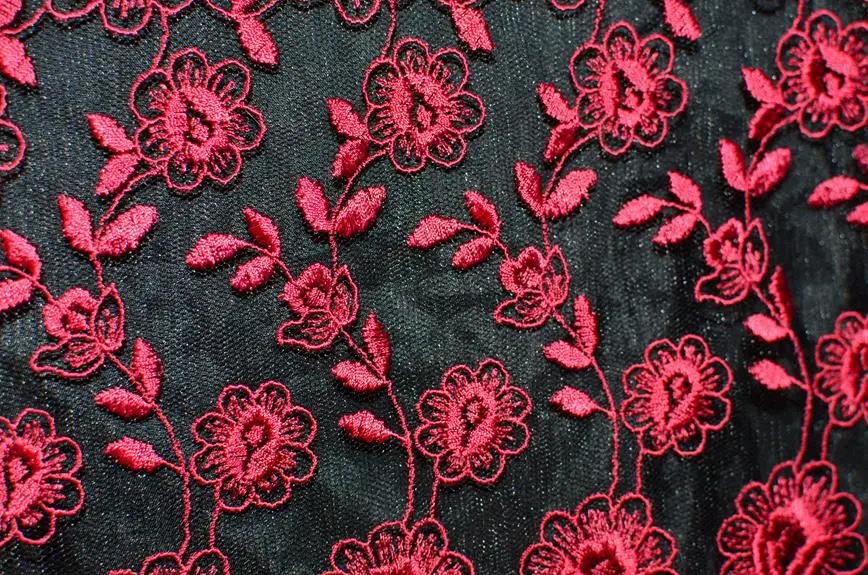
Color plays a crucial role in embroidery, enhancing the visual impact and emotional resonance of your designs. When you choose colors thoughtfully, you create a dynamic connection between your artwork and the viewer. Each color tells a story, evoking different feelings and moods. For instance, warm colors like reds and oranges can convey passion and energy, while cool colors such as blues and greens often communicate calmness and serenity.
Your choice of color also influences the overall composition of your piece. Harmony among colors can bring balance, making your design more appealing. Conversely, contrasting colors can create excitement and draw attention to specific elements. Think about how you can use color to highlight focal points in your embroidery to guide the viewer's gaze.
Additionally, color can symbolize cultural meanings and traditions, enriching your designs with deeper significance. So, when you're planning your embroidery project, don't just think about the aesthetic; consider the emotional and symbolic implications of your color choices.
Color Theory Fundamentals
Understanding color theory is essential for any embroidery designer.
You'll explore the significance of primary colors, discover various color harmonies, and learn how colors can evoke emotions.
These fundamentals will help you make informed choices that enhance your designs.
Primary Color Significance
The significance of primary colors in embroidery design lies in their ability to evoke emotions and convey messages through vibrant visual impact. Red, blue, and yellow serve as the foundation for all other colors, each carrying its own unique meaning. When you choose these colors for your embroidery, you're not just making a design choice; you're creating a specific emotional experience.
Here's a table summarizing the significance of each primary color:
| Color | Significance |
|---|---|
| Red | Passion, energy, love |
| Blue | Calm, trust, stability |
| Yellow | Joy, optimism, creativity |
Incorporating primary colors into your embroidery can dramatically enhance the overall effect of your work. For instance, if you want to draw attention and evoke excitement, red is your go-to choice. Meanwhile, blue can provide a sense of peace and serenity, perfect for designs aimed at relaxation. Lastly, yellow can brighten your piece, instilling happiness and creativity. By understanding the emotional weight of primary colors, you can make more informed decisions in your embroidery projects.
Color Harmonies Explained
Exploring color harmonies reveals how different combinations can create visual balance and enhance the overall impact of your embroidery designs. By understanding color harmonies, you can elevate your work from simple to striking.
There are several key types of color harmonies to consider. Complementary colors, located opposite each other on the color wheel, create a vibrant contrast that can draw attention to your design. Analogous colors, which sit next to each other, provide a more serene and cohesive look, making them great for softer themes.
Triadic harmonies, involving three evenly spaced colors, can add energy and excitement to your pieces. If you want a more subtle effect, try using monochromatic schemes, which involve varying shades and tints of a single color. This approach can create depth without overwhelming the viewer.
Experimenting with these harmonies allows you to find the perfect balance for your embroidery projects. As you practice, you'll develop an intuitive sense of what combinations work best for your vision. Remember, the right color harmony can make your designs not only visually appealing but also memorable.
Emotional Impact of Colors
Colors can evoke powerful emotions, influencing how viewers perceive your embroidery designs and the feelings they inspire. When you choose colors, you're not just picking shades; you're tapping into a rich tapestry of emotional responses. For instance, reds can ignite passion and energy, while blues often evoke calmness and tranquility.
Think about the mood you want to convey. If you're aiming for warmth and comfort, earthy tones like browns and soft yellows might resonate well. Conversely, if you want to project elegance and sophistication, deep purples or blacks could be your best choice.
You'll also want to consider the cultural context of colors. In some cultures, white represents purity, while in others, it can signify mourning. This can significantly impact how your work is received.
As you design, remember that color combinations can enhance or alter the emotional response. Harmonizing colors can create a sense of balance, while contrasting colors can evoke tension or excitement.
Ultimately, your color choices will shape not only the visual appeal but also the emotional journey of your embroidery art.
Emotional Impact of Colors
When you choose colors for your embroidery, you're not just making it look good; you're also tapping into the emotional responses those colors evoke.
Understanding color psychology, the difference between warm and cool tones, and cultural associations can transform your designs from ordinary to deeply meaningful.
Let's explore how these elements can enhance the emotional impact of your work.
Color Psychology Overview
Understanding how different shades influence emotions can transform your embroidery design into a powerful medium of expression. Each color you choose carries its own psychological weight, affecting how others perceive and feel about your work. For instance, vibrant reds can evoke passion and energy, while calming blues often promote tranquility and serenity.
When you incorporate these colors into your designs, consider the message you want to convey. A sunny yellow can inspire happiness and optimism, making it perfect for cheerful themes. Conversely, a deep purple might evoke feelings of luxury and creativity, ideal for more sophisticated projects.
You can also tap into the cultural meanings behind colors. For example, white often symbolizes purity in Western cultures, while in some Eastern cultures, it may represent mourning. This knowledge allows you to create designs that resonate on a deeper level with your audience.
Ultimately, color psychology isn't just about choosing a palette; it's about weaving emotions into your embroidery. By consciously selecting colors, you can enhance the emotional impact of your work and connect more profoundly with anyone who sees it.
Warm Vs. Cool Tones
Warm tones, like reds and oranges, radiate energy and enthusiasm, while cool tones, such as blues and greens, bring a sense of calm and relaxation to your embroidery designs.
When you're choosing colors for your projects, think about the emotional impact you want to achieve. Warm colors can ignite passion and creativity, making them ideal for bold statements or vibrant pieces. If you want to evoke warmth and comfort, consider incorporating these hues into your designs.
On the other hand, cool tones often create a serene atmosphere. They can help you communicate tranquility and peace, making them perfect for more subtle or delicate embroidery.
If you're working on a project intended for a calming space, like a bedroom or meditation area, using blues and greens can enhance that peaceful vibe.
Cultural Color Associations
Colors carry unique meanings across different cultures, influencing how people perceive and react to embroidery designs.
When you choose colors for your work, consider the cultural associations that might resonate with your audience. For instance, red often symbolizes luck and prosperity in Chinese culture, while in many Western cultures, it can represent passion or danger.
In India, yellow signifies knowledge and learning, while in some African cultures, it may represent wealth and status. Blue, on the other hand, is frequently linked to tranquility and peace across various cultures, making it a safe choice for many designs.
You should also think about how these meanings can impact the emotional response of those who see your embroidery. A design that incorporates culturally significant colors can evoke strong feelings and connections. This emotional impact can transform your work from mere decoration into a meaningful expression of cultural identity and heritage.
Ultimately, being aware of these cultural associations allows you to create designs that not only look beautiful but also resonate deeply with your audience, fostering a greater appreciation for your artistry.
Color Combinations and Harmony
When creating an embroidery design, choosing the right color combinations can significantly enhance the overall harmony of your piece. You want colors that complement each other, build visual interest, and convey the mood you're aiming for. Think about using color theory principles like complementary, analogous, or triadic schemes to guide your choices.
Here's a handy reference table to help you understand some effective color combinations:
| Color Scheme | Example Colors | Mood/Effect |
|---|---|---|
| Complementary | Blue & Orange | Vibrant, Energetic |
| Analogous | Yellow, Yellow-Green, Green | Harmonious, Calm |
| Triadic | Red, Blue, Yellow | Balanced, Playful |
| Monochromatic | Shades of Blue | Cohesive, Soothing |
Experiment with different combinations to see what resonates with you. Remember, the right mix can create depth and draw the viewer's eye, while poor choices can make your design feel chaotic. Trust your instincts and let your creativity guide you in achieving that perfect harmony!
Cultural Significance of Colors
Understanding the cultural significance of colors can deepen your embroidery design choices, adding layers of meaning that resonate with diverse audiences. Colors aren't just visually appealing; they carry historical and emotional weight in different cultures. For instance, red symbolizes luck and happiness in Chinese culture, while it often represents love or passion in Western contexts. By knowing these associations, you can create pieces that connect more profoundly with viewers.
Similarly, white is associated with purity and new beginnings in many cultures, but in some, it signifies mourning. When you choose colors, think about the messages they convey. Each color can evoke specific feelings or ideas, shaping how your work is received.
Don't overlook the impact of regional variations as well. A color that's vibrant and joyful in one culture might be considered inappropriate in another. Understanding these nuances allows you to be respectful and intentional in your choices.
When you incorporate culturally significant colors into your embroidery, you not only enhance your designs but also honor the traditions and meanings behind them, making your work more relatable and impactful.
Practical Tips for Color Selection
To create visually striking embroidery, consider using a color wheel as a guide to help you choose harmonious color combinations. Start by identifying your base color, then look for complementary, analogous, or triadic colors that enhance your design.
Complementary colors sit opposite each other on the wheel and create high contrast, while analogous colors, which are next to each other, provide a more subtle, cohesive look.
You should also think about the mood you want to convey. Warm colors like reds and yellows can evoke energy and excitement, while cool colors like blues and greens often promote calmness and serenity.
Don't shy away from experimenting with shades and tints by mixing colors with white or black to create depth.
When selecting embroidery threads, always test your choices on fabric before committing. Different backgrounds can alter the appearance of colors, so try samples on the actual material you'll use.
Lastly, remember to consider the overall balance of your design. A well-distributed color palette can lead to a more visually pleasing result, ensuring your embroidery stands out beautifully.
Trends in Embroidery Color Usage
Recent trends in embroidery color usage highlight a shift towards bold, vibrant hues that capture attention and bring designs to life. You'll notice that many creators are moving away from muted tones and embracing colors that make a statement. This evolution isn't just about aesthetics; it's about conveying emotion and personality through your work.
Here are three key trends you should consider:
- Neon Colors: Bright neon shades are making a comeback, adding an energetic vibe to any piece. They're perfect for modern streetwear and youthful designs.
- Earthy Tones: On the other hand, there's a growing popularity for earthy, natural colors. These hues create a calming effect and connect your designs to nature, perfect for sustainable fashion.
- Monochromatic Schemes: More embroiderers are opting for monochromatic color schemes, which create a striking visual impact. By using different shades of a single color, you can achieve depth and richness in your work.
As you explore these trends, remember to choose colors that resonate with your vision and style!
Frequently Asked Questions
How Does Lighting Affect the Perception of Embroidery Colors?
Lighting dramatically alters how you perceive colors. Natural light enhances vibrancy, while artificial light can create shadows or distort hues. Experimenting with different lighting conditions helps you appreciate the true beauty of your embroidery's colors.
Can Color Choices Influence the Durability of Embroidery Designs?
Yes, your color choices can influence embroidery durability. Certain dyes may fade faster or weaken fibers, while others maintain their vibrancy and strength. Selecting high-quality, fade-resistant colors ensures your designs last longer and look better.
What Tools Help in Selecting Color Palettes for Embroidery?
To select color palettes for embroidery, you can use tools like color wheel apps, online palette generators, and fabric swatch books. Experimenting with these can help you create balanced and visually appealing designs.
Are There Any Color Trends Specific to Certain Embroidery Techniques?
Yes, certain embroidery techniques showcase distinct color trends. For example, traditional folk styles often feature vibrant, bold colors, while modern minimalist techniques may lean towards muted tones. You'll find inspiration in each technique's unique color palette.
How Do Different Fabrics Impact Color Appearance in Embroidery?
Different fabrics absorb and reflect colors uniquely. When you choose a fabric, consider its texture and sheen; they'll alter how colors appear. Experimenting with various materials can lead to surprising and beautiful outcomes in your designs.