When you're looking to create repeating patterns for fabric prints, it's essential to grasp the fundamentals of design. You'll need to consider motif size, layout, and color harmony carefully. Start by brainstorming themes that resonate with your vision, and choose motifs that align with that essence. Digital tools like Adobe Illustrator can enhance your precision, but it's the techniques you apply that will truly set your work apart. As you refine your designs, you'll discover key strategies that can elevate your patterns to the next level. What might those strategies be?
Table of Contents
Key Takeaways
- Understand pattern basics, including repeat size, layout, scale, and spacing, to create effective fabric prints.
- Choose a harmonious color palette by exploring complementary and analogous colors to enhance visual appeal.
- Select motifs that align with your design theme for cohesion and impact in the overall pattern.
- Utilize digital tools like Adobe Illustrator and Procreate for precision and ease in pattern creation.
Understanding Pattern Basics
To create effective fabric prints, it's essential to grasp the fundamental concepts behind patterns. Patterns consist of repeating motifs, which can be simple shapes or intricate designs. Understanding the structure of a pattern is crucial.
You'll want to focus on how elements interact with each other as they repeat across your fabric. Start by determining the size of your repeating unit, known as a 'repeat.' This is the portion of the design that will be duplicated to fill the fabric.
Next, consider the layout. Whether you're working with a grid layout or a more organic arrangement, the way your patterns flow can impact the final appearance. You'll also need to think about the scale of your design. Larger motifs can make a bold statement, while smaller ones may provide a more subtle effect.
Lastly, spacing plays a significant role in your pattern. Adequate spacing between elements can create a sense of harmony, while too little can lead to a cluttered look.
Choosing the Right Colors
When choosing colors for your fabric prints, it's essential to understand color theory basics to create effective combinations.
You'll also want to consider seasonal color trends to keep your designs fresh and appealing.
Lastly, harmonizing your color palette will ensure your patterns are visually striking and cohesive.
Color Theory Basics
Choosing the right colors for your fabric prints can significantly impact their overall appeal and effectiveness.
To start, familiarize yourself with color theory basics, as it'll help you make informed decisions. Begin by understanding the color wheel, which consists of primary, secondary, and tertiary colors. Primary colors—red, blue, and yellow—serve as the foundation for all other colors.
Next, consider color harmony. Complementary colors, located opposite each other on the wheel, create striking contrasts that grab attention. Alternatively, analogous colors, which sit next to each other, offer a more subtle and cohesive look.
You should also think about the emotions you want to evoke. Warm colors like reds and yellows can energize a design, while cool colors like blues and greens can create a calming effect.
Experiment with color saturation and value too; brighter colors can make a bold statement, while muted tones may provide a more sophisticated feel.
Lastly, don't forget to test your color choices in the context of your pattern. What looks good on paper may change once printed, so always prototype to ensure you achieve the desired effect.
Seasonal Color Trends
Seasonal color trends can greatly influence your fabric prints, so paying attention to the latest palettes ensures your designs stay fresh and relevant. Each season brings a unique set of colors that evoke specific feelings and themes. For instance, spring often showcases soft pastels, while autumn leans towards warm, earthy tones.
To choose the right colors for your prints, start by researching fashion forecasts, interior design trends, and even nature's seasonal changes. Look at popular fashion shows, design magazines, and online platforms like Pinterest or Instagram. They often highlight the must-have colors of each season, giving you valuable insight into what's currently appealing to consumers.
Once you've identified trending colors, think about how they resonate with your target audience. Are they vibrant and bold, or subtle and calming? This choice will help you create prints that not only attract attention but also connect emotionally with your buyers.
Don't shy away from experimenting with combinations of these trendy colors; sometimes, unexpected pairings can lead to stunning results. Ultimately, staying in tune with seasonal color trends will elevate your fabric prints and keep them aligned with the market's demands.
Harmonizing Color Palettes
Understanding how to harmonize color palettes is key to creating visually appealing fabric prints that resonate with your audience. Start by selecting a primary color that captures the essence of your design. From there, build your palette using complementary, analogous, or triadic colors.
Complementary colors sit opposite each other on the color wheel and create vibrant contrasts, while analogous colors, which are adjacent, provide a more soothing effect.
Next, consider the mood you want your fabric to evoke. Warm colors like reds and yellows can convey energy, while cool colors like blues and greens often elicit calmness. Test your colors together by creating swatches; this will help you see how they interact in a pattern.
Don't forget about the importance of balance. Use a dominant color, supported by secondary and accent colors, to ensure your design feels cohesive. Remember, less can be more—too many colors can overwhelm the viewer.
Selecting Motifs and Elements
When selecting motifs and elements for your fabric prints, think about the design themes you want to convey.
Consider how different colors and scales will impact the overall look and feel of your pattern.
Balancing these aspects will help you create a cohesive and eye-catching design.
Choosing Design Themes
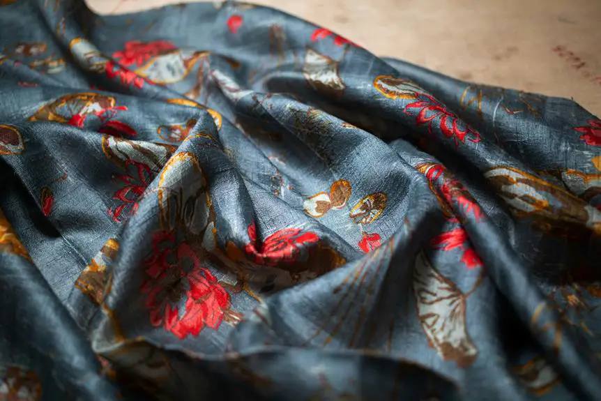
Selecting the right motifs and elements is crucial for creating a cohesive and visually appealing fabric print. Start by brainstorming themes that resonate with your vision. Think about what message or mood you want to convey—whether it's playful, elegant, or rustic. Once you've settled on a theme, choose motifs that align with it.
For instance, if you're going for a botanical theme, consider using leaves, flowers, or even insects. These elements should complement each other and reinforce the overall design. You might also want to incorporate geometric shapes or abstract designs to add depth and interest.
Next, think about the scale of your motifs. Larger elements can create bold statements, while smaller ones can add subtle texture. Experiment with different combinations to see what works best.
Color Palette Considerations
Choosing the right color palette can enhance your motifs and elevate the overall design of your fabric print. When selecting colors, think about the emotions and themes you want to convey. Are you aiming for something vibrant and cheerful, or muted and sophisticated?
To help you visualize your options, here's a simple color palette table:
| Color Name | Hex Code | Mood/Theme |
|---|---|---|
| Bright Coral | #FF6F61 | Energetic, Fun |
| Soft Lavender | #E6E6FA | Calm, Relaxing |
| Forest Green | #228B22 | Natural, Earthy |
| Sunny Yellow | #FFD700 | Cheerful, Optimistic |
| Ocean Blue | #1E90FF | Trustworthy, Fresh |
Once you've narrowed down your choices, test them with your motifs. Place different colors next to your designs to see how they interact. Remember, balance is key; too many contrasting colors can create chaos, while a harmonious palette will unify your patterns beautifully. Keep experimenting until you find a combination that speaks to your vision!
Scale and Repetition
Understanding scale and repetition is crucial for creating visually appealing fabric prints, as it helps you determine how motifs will interact within the overall design.
Start by selecting motifs that resonate with your theme. Consider their size in relation to the fabric; larger designs can dominate a space, while smaller ones might provide subtlety.
Next, think about how these motifs will repeat. You can create a balanced pattern by repeating elements at regular intervals, or you can play with randomness for a more organic feel. Experiment with different arrangements to see how scale affects the overall impact of your design.
Don't forget to consider the negative space between motifs; this can greatly influence the visual flow. If elements are too close together, the design may feel cluttered. Conversely, too much space can make it appear sparse.
Lastly, remember that the interaction of scale and repetition can evoke different moods. A tight, small pattern may feel energetic, while a larger, spaced-out design can convey calmness. Keep these principles in mind as you craft your fabric print, ensuring a harmonious and engaging outcome.
Sketching Your Design Ideas
When sketching your design ideas, let your creativity flow freely to capture the essence of your envisioned fabric pattern. Start with a brainstorming session; jot down themes, colors, and motifs that inspire you. Don't hold back—doodle anything that comes to mind. You might discover unexpected combinations that spark your imagination.
Next, grab your sketchbook and pencil. Begin with rough outlines of your ideas, focusing on shapes and forms. You don't need to worry about perfection at this stage; the goal is to explore. Use different techniques like line drawing, shading, or even watercolor washes to visualize your concepts. Experiment with various compositions and placements, considering how elements interact within the repeating structure.
As you sketch, think about scale and how your design will translate to fabric. Will it be bold or subtle? Will it repeat seamlessly? Keep these questions in mind, and refine your sketches accordingly.
Once you have a collection of designs, choose the ones that resonate most with you. These sketches will serve as the foundation for your fabric pattern, paving the way for the next steps in your creative journey.
Digital Tools for Pattern Creation
Utilizing digital tools can significantly enhance your ability to create intricate and seamless fabric patterns. With a range of software and applications at your fingertips, you can transform your hand-drawn sketches into vibrant, repeatable designs.
Here are some essential tools to consider:
- Adobe Illustrator: A powerful vector graphic software that allows you to create scalable patterns with precision.
- Procreate: This iPad app lets you draw and paint with a natural feel, making it great for artists who prefer a tactile approach.
- Photoshop: Ideal for photo manipulation and creating textures, Photoshop can help you blend and layer elements in your patterns.
These tools not only streamline your workflow but also enable you to experiment with colors, shapes, and layouts, making it easier to refine your designs.
Techniques for Seamless Repeats
Mastering the art of creating seamless repeats is key to transforming your digital designs into stunning fabric prints. To achieve this, start by designing your pattern in a way that it can tile without visible seams. One effective technique is to use a square or rectangular canvas. Create your pattern within this space but ensure that elements extend beyond the edges. This way, when you tile your design, the elements will connect seamlessly.
Next, utilize the offset method. Duplicate your design, then shift the duplicates by half of your canvas size both horizontally and vertically. This helps you see how the edges align and allows you to adjust any misaligned elements.
You can also experiment with layering, where you create multiple layers of patterns that can overlap or interact harmoniously.
Another technique involves using guides and grids to maintain symmetry and balance within your design. Adjust the scale and rotation of individual elements to add visual interest while keeping the overall pattern cohesive.
Testing and Finalizing Your Patterns
Testing your patterns is essential to ensure they look great when printed, so take the time to evaluate them before finalizing your designs. Here are some steps to help you through this process:
- Print Samples: Always print a sample of your pattern to see how colors and details translate onto fabric.
- Check Scale: Make sure the scale of your design works well on the intended fabric. Sometimes, what looks good on screen may need adjustments in size.
- Test Color: Colors can shift during printing, so compare your printed samples with your digital designs to identify any discrepancies.
Once you've gathered all your insights, make the necessary adjustments to your pattern. This might involve tweaking colors, resizing elements, or even reworking motifs.
After refining your design, print another sample to confirm everything looks perfect. Only when you're completely satisfied should you finalize your pattern for production.
Happy designing!
Frequently Asked Questions
How Do I Choose Fabric Types for My Patterns?
When you choose fabric types for your patterns, consider the texture, weight, and drape. Think about how the fabric will enhance your design and suit your intended use, whether it's clothing, home decor, or accessories.
Can I Use Existing Images for My Fabric Prints?
Yes, you can definitely use existing images for your fabric prints. Just make sure you have the right permissions or licenses. It's a great way to incorporate unique designs into your projects!
What Are Common Mistakes to Avoid in Pattern Design?
When designing patterns, avoid overcrowding your design, using clashing colors, or neglecting scale. It's crucial to maintain consistency and balance; otherwise, your patterns might end up looking chaotic and unappealing to your audience.
How Can I Market My Fabric Patterns Effectively?
To market your fabric patterns effectively, leverage social media platforms, collaborate with influencers, and showcase your designs in engaging visuals. Attend craft fairs, network with creators, and build a strong online presence to attract customers.
What Printing Methods Are Best for My Designs?
You'll want to consider methods like digital printing for intricate designs, screen printing for bold colors, or sublimation for vibrant results on synthetic fabrics. Each method offers unique benefits, so choose based on your design's needs.

- How Does Ring Spun Cotton Affect Garment Fit and Shape Retention? - August 13, 2024
- What Are the Challenges in Producing Ring Spun Cotton? - August 13, 2024
- Is Ring Spun Cotton Suitable for Plus-Size Clothing? - August 13, 2024


